AsideExpandableMenu
Example
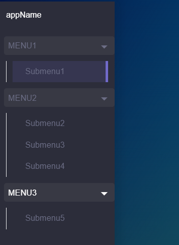
This component allows you to create an aside expandable menu
<aside-expandable-menu
  :app-name="appName"
  :menu="menu"
/>

export default {
  name: 'App',
  data() {
    return {
      appName: this.$config.appName,
      menu: [
        'Menu1',
        [
          {
            to: '/submenu1',
            label: 'Submenu1',
            icon: 'icon1',
          }
        ],
        'Menu2',
        [
          {
            to: '/submenu2',
            label: 'Submenu2',
            icon: 'icon2',
          },
          {
            to: '/submenu3',
            label: 'Submenu3',
            icon: 'icon3',
          },
          {
            to: '/submenu4,
            label: 'Submenu4',
            icon: 'icon4',
          },
        ],
        'Menu3',
        [
          {
            to: '/submenu5',
            label: 'Submenu5',
            icon: 'icon5',
          },
        ]
      ]
    }
  }
}
Props
| Name | Description | Type | Required | Default |
|---|---|---|---|---|
| menu | It has this structure: [ 'Cat 1', ['Item 1', 'Item 2', ...], 'Cat 2', [...], ... ].The items of type string conform the categories of the menu.The items of type array conform the elements of the menu. | Array | false | |
| appName | The App name | String | false | "" |
| isAccordion | Collapse items there are not expanded | Boolean | false | false |
| isOverlay | Same as overlay in Buefy | Boolean | false | false |
| isRight | Same as right in Buefy | Boolean | false | false |
| isFullWidth | Same as fullwidth in Buefy | Boolean | false | false |
| isFullHeigth | Same as fullheigth in Buefy | Boolean | false | true |