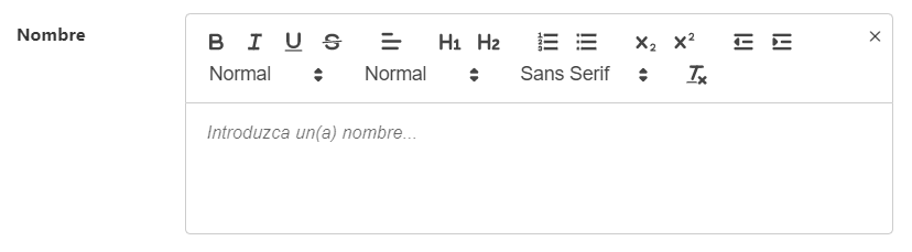
TextEditor
This component allows you to create a text editor component.
Example
export default {
  name: "App",
  data() {
    return {
      form: {
        servicesDefinition: {
          type: TextEditor,
          default: "",
          "field-wrapper": { class: "is-12" },
          "field-input": {
            label: "label",
            placeholder: this.$t("placeholder", {
              key: this.$t("text").toLowerCase(),
            }),
            plainText: true,
            countWords: true,
          },
          events: {
            input: (v) => {},
          },
        },
      },
    };
  },
};
Props
| Name | Description | Type | Required | Default |
|---|---|---|---|---|
| value | Is some String containin HTML content or plain Text (plainText prop) | — | false | null |
| plainText | On true value prop will return an object like: { html: *, plainText: '...' } | Boolean | false | false |
| theme | Should by one of the default themes of Quill {snow, bubble, core } | String | false | "snow" |
| allowCodeBlocks | - | Boolean | false | false |
| allowTextDirection | - | Boolean | false | false |
| allowMedia | Allows media like image and video links and links | Boolean | false | false |
| allowColors | Allows colors for text and text background | Boolean | false | false |
| validationMode | - | String | false | "aggressive" |
| horizontal | - | Boolean | false | true |
| labelInside | - | Boolean | false | false |
| labelOnBorder | - | Boolean | false | false |
| hideValidation | - | Boolean | false | false |
| isRequired | - | Boolean | false | true |
| icon | - | String | false | "" |
| clearIconSize | - | String | false | "mdi-24px" |
| clearIconCustomClass | - | String | false | "" |
| showClearIcon | - | Boolean | false | true |
| countWords | - | Boolean | false | true |
| locale | Locale string {en, es ...} for display language on component | String | false | "en" |
Events
| Event Name | Description | Parameters |
|---|---|---|
| input | - | - |
| blur | - | - |
| focus | - | - |
| ready | - | - |