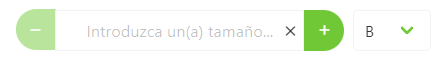
NumberSelectMeasureComponent
This component allows you to create a measure component and select its options
Example
export default {
  name: "App",
  data() {
    return {
      form: {
        servicesDefinition: {
          type: NumberSelectMeasureComponent,
          default: 0,
          "field-wrapper": { class: "is-12" },
          "field-input": {
            isRequired: false,
            label: "label",
            placeholder: this.$t("placeholder", {
              key: this.$t("sizeLabel").toLowerCase(),
            }),
            controlsPosition: "compact",
            controlsAlignment: "center",
            showClearIcon: true,
            min: 0,
          },
          events: {
            input: (val) => {},
          },
        },
      },
    };
  },
};
Props
| Name | Description | Type | Required | Default |
|---|---|---|---|---|
| horizontal | - | Boolean | false | true |
| vid | - | String | false | undefined |
| value | - | — | false | null |
| labelInside | - | Boolean | false | false |
| labelOnBorder | - | Boolean | false | false |
| validationMode | - | String | false | "aggressive" |
| hideValidation | - | Boolean | false | false |
| isRequired | - | Boolean | false | true |
| min | - | Number | false | - |
| max | - | Number | false | - |
| step | - | Number | false | 1 |
| controlsRounded | - | Boolean | false | true |
| controls | - | Boolean | false | true |
| controlsPosition | - | String | false | "" |
| controlsAlignment | - | String | false | "right" |
| showClearIcon | - | Boolean | false | false |
| locale | Locale string {en, es ...} for display language on component | String | false | "en" |
| clearIconCustomClass | - | String | false | "" |
| clearIconSize | - | String | false | "" |
| range | - | Boolean | false | true |
Events
| Event Name | Description | Parameters |
|---|---|---|
| input | - | - |
ectMeasureComponent:events:start -->
| Event Name | Description | Parameters |
|---|---|---|
| input | - | - |