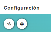
MultipleButtonsColumnComponent
Uses the b-button component, see Buefy documentation
Example
<template>
  <div>
    <section>
      <server-table-component
        data-url="/services"
        v-bind="servicesDefinition"
      />
    </section>
  </div>
</template>;

export default {
  name: "App",
  data() {
    return {
      servicesDefinition: {
        vtable: {
          headers: [
            {
              text: "Service Id",
              value: "service_Id",
              align: "left",
              render: {
                type: MultipleButtonsColumnComponent,
                props: {
                  buttons: [
                    {
                      icon: "account-key-outline",
                      type: "is-white",
                      tooltip: {
                        label: this.$tc("permission", 2),
                        type: "is-white",
                        position: "is-top",
                      },
                    },
                    {
                      icon: "cog",
                      type: "is-white",
                      tooltip: {
                        label: this.$t("configuration"),
                        type: "is-white",
                        position: "is-top",
                      },
                    },
                  ],
                },
              },
              sortable: true,
              class: "white-space-nowrap",
            },
          ],
        },
      },
    };
  },
};
Props
| Name | Description | Type | Required | Default |
|---|---|---|---|---|
| buttons | Buttons array | Array | false | |
| roundedButtons | - | Boolean | false | true |
| buttonsSize | - | String | false | "is-small" |
| value | - | String / Number / Boolean / Object | false | undefined |