CheckboxPicker
This component allows you to select a single or grouped options
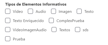
Example
export default {
  name: "App",
  data() {
    return {
      form: {
        servicesDefinition: {
          type: CheckboxPicker,
          default: [],
          "field-wrapper": {
            class: "is-12 group-is-block",
          },
          "field-input": {
            label: this.$tc("permission", 2),
            horizontal: false,
            options: {
              allowVisualizeComments: this.$t("allow", {
                key: this.$tc("comment", 2).toLowerCase(),
              }),
              allowVisualizeLikes: this.$t("allow", { key: "likes" }),
              allowVisualizeSubscribe: this.$t("allow", {
                key: this.$tc("subscribe", 2),
              }),
              allowVisualizeSubscribeNotifications: this.$t("allow", {
                key: this.$tc("subscribeNotify", 2),
              }),
            },
          },
        },
      },
    };
  },
};
Props
| Name | Description | Type | Required | Default |
|---|---|---|---|---|
| options | Items | Object | false | null |
| type | Type (color) of the control, optional | String | false | null |
| value | - | Array | false | |
| isRequired | - | Boolean | false | false |
| validationMode | - | String | false | "aggressive" |
| label | - | String | false | "" |
Events
| Event Name | Description | Parameters |
|---|---|---|
| input | - | - |