AutocompleteInput
This component allows you to create a extended input that provide suggestions while the user types.
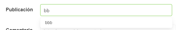
Example
<autocomplete-input
  :is-required="isRequired"
  :allow-add="false"
  :expanded="expanded"
  :option-name="optionName"
  :option-id="optionId"
  :label-inside="labelInside"
  :label-on-border="labelOnBorder"
  :horizontal="horizontal"
  :open-on-focus="openOnFocus"
  :debounce="debounce"
  :data-url="dataUrl"
  :locale="locale"
  :filter-param="filterParam"
  @input="select"
/>

export default {
  name: "App",
  data() {
    return {
      form: {
        servicesDefinition: {
          type: AutocompleteInput,
          default: '',
          'field-wrapper': { class: 'is-12' },
          'field-input': {
            label: this.$tc('incomingStreamLabel'),
            placeholder: this.$t('placeholder', {
              key: this.$tc('incomingStreamLabel').toLowerCase()
            }),
            optionId: 'email',
            optionName: 'fullName',
            dataUrl: `/User?Filters=isDeleted==false`,
            allowAdd: false,
            openOnFocus: true
          },
          events: {
            input: (val) => {},
          },
        },
      },
    };
  },
};
Props
| Name | Description | Type | Required | Default |
|---|---|---|---|---|
| locale | Locale string {en, es ...} for display language on component | String | false | "en" |
| isRequired | - | Boolean | false | true |
| items | - | Array | false | |
| dataUrl | Url services | String | false | undefined |
| optionName | Property of the object (if data is array of objects) to use as display text, and to keep track of selected option | String | false | undefined |
| optionId | Option id | String | false | undefined |
| searchParam | - | String | false | "SearchText" |
| openOnFocus | Open dropdown list on focus | Boolean | false | true |
| allowAdd | - | Boolean | false | false |
| keepFirst | The first option will always be pre-selected (easier to just hit enter or tab) | Boolean | false | false |
| checkInfiniteScroll | - | Boolean | false | false |
| isLoading | - | Boolean | false | false |
| value | - | — | false | null |
| horizontal | - | Boolean | false | true |
| labelInside | - | Boolean | false | false |
| labelOnBorder | - | Boolean | false | false |
| validationMode | - | String | false | "aggressive" |
| hideValidation | - | Boolean | false | false |
| customRule | - | String | false | undefined |
| showClearIcon | - | Boolean | false | false |
| addNewItem | - | Function | false | () => {} |
| debounce | Determines the list debounce (a time between the input event and a function execution). | Number | false | 500 |
| idFilter | - | Boolean | false | false |
Events
| Event Name | Description | Parameters |
|---|---|---|
| input | - | - |