CardMenu
This component allows you to create a card menu.
Example
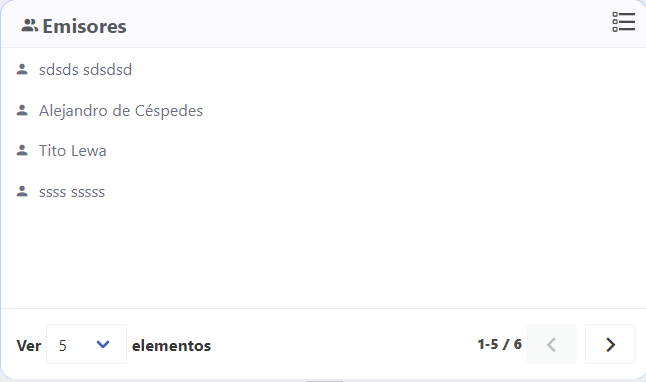
<card-menu
    :title="$t('cardTitle')"
    card-title-class="is-size-5"
    icon="account-multiple"
    custom-class="splitter-card"
    :locale="$i18n.locale"
    :items="items"
    :data-url="getBasePath"
    :item-fields-for-label="['names', 'lastNames']"
    :show-context-menu="true"
    context-menu-id="elements-context-menu"
    :is-loading="isLoading"
    :ctx-menu-options="[
      {
        icon: 'account-box-outline',
        id: 'add',
        name: $t('add', { element: $tc('emissor') })
      }
    ]"
    :ctx-menu-item-options="[
      {
        icon: 'account-box-outline',
        id: 'add',
        name: $t('add', { element: $tc('emissor') })
      },
      {
        icon: 'account-edit-outline',
        id: 'edit',
        name: $t('edit', { element: $tc('emissor') })
      },
      {
        icon: 'account-remove-outline',
        id: 'delete',
        name: $t('delete', { element: $tc('emissor') })
      }
    ]"
    :allow-drag="isDraggEnabled || dragEnabled"
    :before-render-items="loadItemIcon"
    @ctxOptionClicked="optionClicked"
    @itemSelected="itemSelected"
    @dragStart="transmitterDragged"
  >
  </card-menu>
Props
| Name | Description | Type | Required | Default |
|---|---|---|---|---|
| title | The card title | String | false | "" |
| cardSubtitle | The card subtitle | String | false | null |
| cardTitleClass | The card title class | String | false | "is-size-4" |
| cardSubtitleClass | The card subtitle class | String | false | "is-size-5" |
| icon | The icon to show in the card | String | false | "" |
| customClass | The custom class to use in the card | String | false | "" |
| menuCustomClass | The custom class to use in the menu | String | false | "master-details-selection-container" |
| beforeRenderItems | Allows you to perform an action with loaded items before render them. Ex: items = beforeRenderItems(loadedItems) | Function | false | undefined |
| items | The items that the component use to construct the list to show in the menu | Array | false | |
| itemFieldsForLabel | The fields name for construct the label of every item | Array | true | |
| showPagination | Allows you to show or not the pagination | Boolean | false | true |
| dataUrl | A url to charge data | String | false | undefined |
| paginationSize | Same as size in Buefy b-pagination | String | false | "is-default" |
| paginationIsSimple | Same as simple in Buefy b-pagination | Boolean | false | true |
| paginationIsRounded | Same as rounded in Buefy b-pagination | Boolean | false | false |
| paginationPerPage | Count of elements by page | Number | false | 5 |
| paginationPrevIcon | Same as icon-prev in Buefy b-pagination | String | false | undefined |
| paginationNextIcon | Same as icon-next in Buefy b-pagination | String | false | undefined |
| itemsPerPageOptions | List of counts used to change de count of elements showed in the table | Array | false | 2,5,10,25,50,100 |
| showContextMenu | Allows you to show or not the contex menu | Boolean | false | false |
| contextMenuId | Allows you to indicate the contex menu id | String | false | undefined |
| ctxMenuOptions | List of options to show in the context menu | Array | false | |
| ctxMenuItemOptions | List of options to show in the context menu | Array | false | |
| locale | Locale string {en, es ...} for display language on component | String | false | "en" |
| isLoading | Disable the menu items and enable a b-loading to let you know the component is charging | Boolean | false | false |
| allowDrag | Same as draggable in Buefy b-menu-item | Boolean | false | false |
| dropEffect | Effect to apply on drag | String | false | "copy" |
Events
| Event Name | Description | Parameters |
|---|---|---|
| itemSelected | - | - |
| ctxOptionClicked | - | - |
| dragStart | - | - |
| dragEnd | - | - |