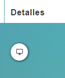
ButtonColumnComponent
This component allows you a button inside the column of the table
Example
<template>
  <div>
    <section>
      <server-table-component
        data-url="/services"
        v-bind="servicesDefinition"
      />
    </section>
  </div>
</template>;

export default {
  name: "App",
  data() {
    return {
      servicesDefinition: {
        vtable: {
          headers: [
            {
              text: "Service Id",
              value: "service_Id",
              align: "left",
              render: {
                type: ButtonColumnComponent,
                props: {
                  icon: "monitor",
                  tooltip: { label: this.$t("details"), type: "is-white" },
                  content: "streamTypeStr",
                },
                events: {
                  confirm: (v) => this.showOfuscatedData(v),
                },
              },
              sortable: true,
              class: "white-space-nowrap",
            },
          ],
        },
      },
    };
  },
};
Props
| Name | Description | Type | Required | Default |
|---|---|---|---|---|
| value | - | — | false | "0" |
| icon | - | String | false | "monitor" |
| isRounded | - | Boolean | false | true |
| buttonText | - | String | false | "" |
| buttonClass | - | String / Object | false | "table-buttons" |
| tooltip | - | String / Object | false | "" |
Events
| Event Name | Description | Parameters |
|---|---|---|
| confirm | - | - |