InputComponent
This component allows you to create a input component.
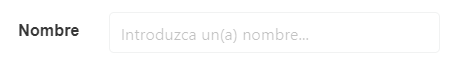
Example
<input-component
    type="text"
    :rules="rules"
    :label="label"
    :horizontal="horizontal"
    :vid="vid"
    :label-inside="labelInside"
    :label-on-border="labelOnBorder"
    :validation-mode="validationMode"
    :lazy="lazy"
    :icon="icon"
    :icon-right-clickable="iconRightClickable"
    :icon-right="iconRight"
    :clearIconSize="clearIconSize"
    :clearIconCustomClass="clearIconCustomClass"
    :showClearIcon="showClearIcon"
    :hideValidation="hideValidation"
    :isLoading="isLoading"
  />
Props
| Name | Description | Type | Required | Default |
|---|---|---|---|---|
| fieldType | - | String | false | "on" |
| vid | - | String | false | undefined |
| rules | - | Object / String | false | "" |
| value | must be included in props | — | false | null |
| horizontal | - | Boolean | false | true |
| labelInside | - | Boolean | false | false |
| labelOnBorder | - | Boolean | false | false |
| validationMode | - | String | false | "aggressive" |
| hideValidation | - | Boolean | false | false |
| passwordReveal | - | Boolean | false | false |
| rows | - | Number | false | - |
| icon | - | String | false | "" |
| iconRight | - | String | false | undefined |
| iconRightClickable | - | Boolean | false | false |
| iconRightClick | - | Function | false | () => {} |
| lazy | Makes the binding lazy. Note: v-model.lazy won't work | Boolean | false | false |
| clearIconSize | - | String | false | "is-small" |
| clearIconCustomClass | - | String | false | "" |
| showClearIcon | - | Boolean | false | false |
| isLoading | - | Boolean | false | false |
Events
| Event Name | Description | Parameters |
|---|---|---|
| input | - | - |
| focus | - | - |