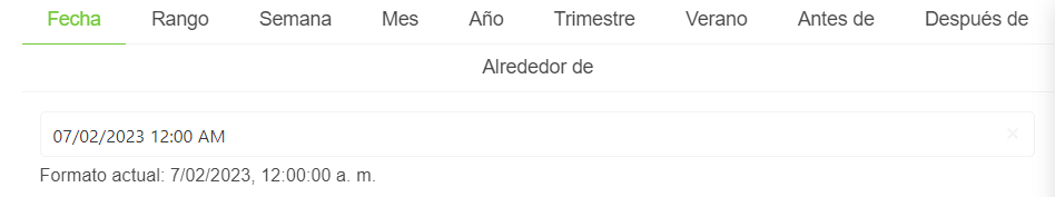
FullDateTimePicker
This component allows you to create a datetime component in what you can especify even more the date that you want to insert.
It depends on YearSummerTrimesterDateComponent, DateTimeTabsSelectorComponent.
Example
<full-date-time-picker
    is-required="false",
    :editable="true",
    :show-clear-button="true",
    :show-today-button="true",
    position="is-top-right"
>
    <slot name="input-label" />
</full-date-time-picker>
Props
| Name | Description | Type | Required | Default |
|---|---|---|---|---|
| value | Inner value of the component | — | false | null |
| activeOperator | Allows you to indicate the active operator in the component | String | false | "date" |
| trimesterSummerDateFormat | Allows you to indicate the format of the returned year-summer-trimester-date-component | String | false | "YYYY-MM-DD" |
| editable | Allows you to indicate if the date-time-tabs-selector-component is editable | Boolean | false | true |
| showClearButton | Allows you to indicate if the clear bottom will be displayed or not | Boolean | false | true |
| showTodayButton | Allows you to indicate if the today button will be displayed or not | Boolean | false | true |
| validationMode | Validation mode to ValidationProvider | String | false | "aggressive" |
| hideValidation | Validation mode to ValidationProvider | Boolean | false | false |
| locale | Locale string {en, es ...} for display language on component | String | false | "en" |
Events
| Event Name | Description | Parameters |
|---|---|---|
| operatorUpdated | - | - |
| input | - | - |