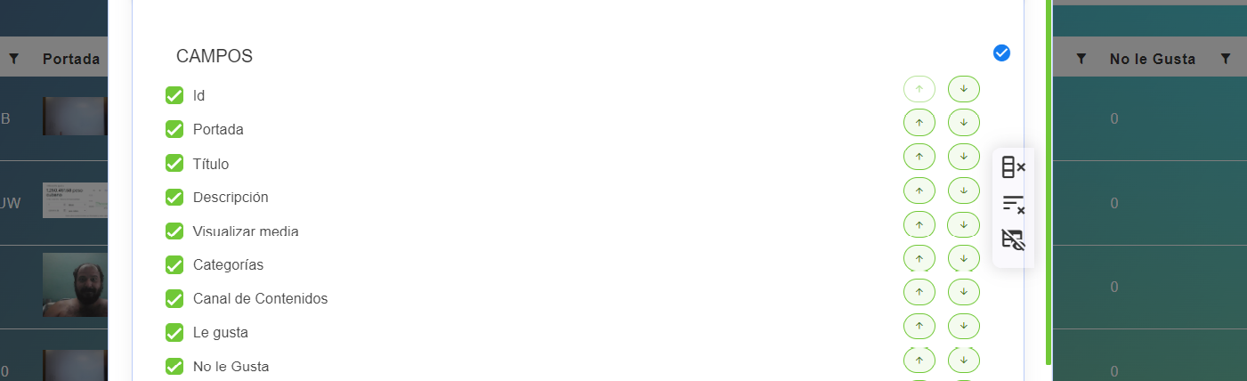
CheckedUpDownHeaders
This component allows you to create a configuration to change the order (and select the visible) of the columns of a table.
It depends on ValidationObserver, extend and required from Vee Validate.
Example
<checked-up-down-headers
    :options="vtable.headers"
    label: "Some Label"
    horizontal: false
/>

export default {
  name: 'App',
  data() {
    return {
      vtable: {
          headers: [
            {
              text: "Service Id",
              value: "service_Id",
              align: "left",
              render: {
                type: NumberFormatColumnComponent,
              },
              sortable: true,
              class: "white-space-nowrap",
            },
            {
              text: "Service Name",
              value: "service_Name",
              align: "left",
              sortable: true,
              custom: true,
              render: {
                type: ContentButtonColumnComponent,
                props: {
                  content: "service_Name",
                  button: {
                    isRounded: true,
                    type: "",
                    icon: "monitor",
                    size: "is-small",
                    tooltip: {
                      label: "Visualize original values",
                      position: "is-top",
                      type: "is-white",
                    },
                  },
                },
                events: {
                  "button-clicked": this.showOriginalValues,
                },
              },
            },
            {
              text: "Service Provider",
              value: "service_Provider_Name",
              align: "left",
              sortable: true,
              custom: true,
              render: {
                type: ContentButtonColumnComponent,
                props: {
                  content: "service_Provider_Name",
                  button: {
                    isRounded: true,
                    type: "",
                    icon: "monitor",
                    size: "is-small",
                    tooltip: {
                      label: "Visualize original values",
                      position: "is-top",
                      type: "is-white",
                    },
                  },
                },
                events: {
                  "button-clicked": this.showOriginalValuesProvider,
                },
              },
            },
            {
              text: "Service Type",
              value: "service_Type_Name",
              align: "left",
              sortable: true,
              rendervalue: (v) => this.$snakeToTitle(v),
            },
            {
              text: "Event Actions",
              value: "",
              align: "left",
              render: {
                type: MultipleButtonsColumnComponent,
                props: {
                  buttons: [
                    {
                      icon: "monitor",
                      type: "is-primary",
                      tooltip: {
                        label: "Visualize events",
                        type: "is-primary",
                        position: "is-top",
                      },
                    },
                  ],
                },
                events: {
                  button0Clicked: this.visualizeServiceEvents,
                },
              },
              sortable: false,
            },
          ],
        }
    }
  }
}
Props
| Name | Description | Type | Required | Default |
|---|---|---|---|---|
| options | Options that are showed to check or change its order | Object | false | null |
| type | Same as type in Buefy b-checkbox | String | false | null |
| value | Inner value of the component | Array | false | |
| isRequired | Allows you to indicate id the component is required or not | Boolean | false | false |
| validationMode | Vlaidation mode to ValidationProvider | String | false | "aggressive" |
| label | Label to show at the beggining | String | false | "" |
Events
| Event Name | Description | Parameters |
|---|---|---|
| input | - | - |
| upDown | - | - |