RadioPicker
This component allows you to select an option from a set
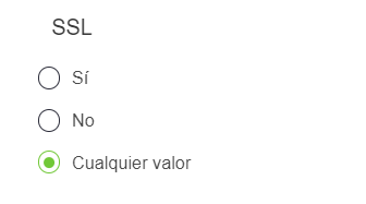
Example
export default {
  name: "App",
  data() {
    return {
      form: {
        servicesDefinition: {
          type: RadioPicker,
          default: null,
          "field-wrapper": { class: "is-12" },
          "field-input": {
            label: label,
            options: {
              true: this.$t("trueText"),
              false: this.$t("falseText"),
              null: this.$t("anyLabel"),
            },
            customClass: "group-is-block",
          },
        },
      },
    };
  },
};
Props
| Name | Description | Type | Required | Default |
|---|---|---|---|---|
| options | Items | Object | false | null |
| type | Type (color) of the control, optional | String | false | null |
| value | - | String / Number | false | null |
| isDisabled | - | Boolean | false | false |
| label | - | String | false | "" |
| isRequired | - | Boolean | false | false |
| validationMode | - | String | false | "aggressive" |
| customClass | - | String | false | "" |
Events
| Event Name | Description | Parameters |
|---|---|---|
| input | - | - |