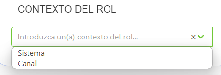
SelectComponent
This component allows you to create a select component
Example
export default {
  name: "App",
  data() {
    return {
      form: {
        servicesDefinition: {
          type: SelectComponent,
          default: "",
          "field-wrapper": { class: "is-12" },
          "field-input": {
            isRequired: false,
            label: this.$t("approveMethod"),
            expanded: true,
            placeholder: this.$t("placeholder", {
              key: this.$t("approveMethod").toLowerCase(),
            }),
            optionId: "id",
            optionName: "name",
            optionItems: [
              { id: "1", name: "name1" },
              { id: "2", name: "name2" },
              { id: "3", name: "name3" },
            ],
            showClearIcon: true,
          },
          events: {
            input: (v) => {},
          },
        },
      },
    };
  },
};
Props
| Name | Description | Type | Required | Default |
|---|---|---|---|---|
| vid | - | String | false | undefined |
| value | must be included in props | — | false | null |
| horizontal | - | Boolean | false | true |
| labelInside | - | Boolean | false | false |
| labelOnBorder | - | Boolean | false | false |
| validationMode | - | String | false | "aggressive" |
| hideValidation | - | Boolean | false | false |
| optionId | Option id | String | false | undefined |
| optionName | Option name | String | false | undefined |
| optionItems | Items | Array | false | |
| nativeSize | Same as native size | Number | false | 1 |
| isRequired | - | Boolean | false | true |
| size | Size of the select, optional | String | false | undefined |
| placeholder | - | String | false | undefined |
| showClearIcon | - | Boolean | false | false |
| clearIconSize | - | String | false | "is-small" |
| clearIconCustomClass | - | String | false | "" |
| locale | Locale string {en, es ...} for display language on component | String | false | "en" |
Events
| Event Name | Description | Parameters |
|---|---|---|
| input | - | - |
| focus | - | - |
| blur | - | - |