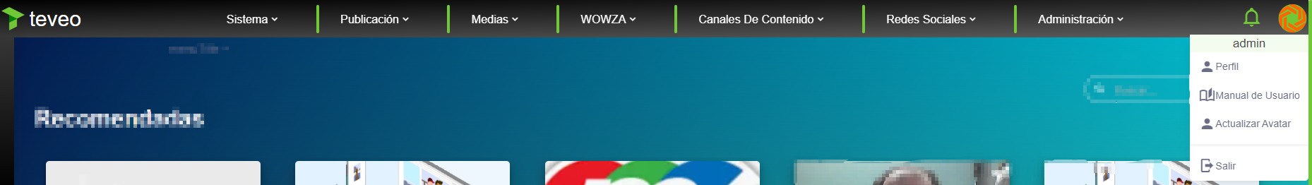
This component allows you to create a nav bar expanded .
It contains a label for the app name, app logo, custom avatar and menu items with two options: Auth and register..
Example
<nav-bar-expanded
  app-name="appName"
  app-logo="appLogo"
  menu="menu"
  show-auth-and-register="true"
  locale="locale"
  custom-avatar="customAvatar"
  user-field="userField"
/>
Props
| Name | Description | Type | Required | Default |
|---|
| appName | The App name | String | false | "" |
| appIcon | MDI Icon | String | false | "" |
| appLogo | FavIcon image static path | String / Function | false | "" |
| logoutOnly | - | Boolean | false | false |
| showSystemHealth | - | Boolean | false | true |
| showUserManual | - | Boolean | false | true |
| menu | Items menu | Array | false | |
| customAvatar | - | Boolean | false | false |
| showAuthAndRegister | - | Boolean | false | false |
| loginStrategy | - | String | false | "refresh" |
| userIsEmail | - | Boolean | false | true |
| userField | - | String | false | "user" |
| passwordField | - | String | false | "password" |
| horizontalInputs | - | Boolean | false | false |
| expandedInputs | - | Boolean | false | true |
| roundedInputs | - | Boolean | false | false |
| inputsSize | - | String | false | undefined |
| labelInsideInputs | - | Boolean | false | false |
| labelOnBorderInputs | - | Boolean | false | false |
| closeOnSubmit | - | Boolean | false | false |
| locale | Locale string {en, es ...} for display language on component | String | false | "en" |
Events
| Event Name | Description | Parameters |
|---|
| cancel-all | - | - |
| loggedIn | - | - |
| logout | 'identity' | - |
| register-data | - | - |
| user-forgot | - | - |
Slots
| Name | Description | Default Slot Content |
|---|
| navbar-brand-left | - | - |
| menu-items | - | - |
| navbar-items | - | - |
| sign-in-with | - | - |
| custom-navbar-end-items | - | - |
| menu-items | - | - |
Methods
| Method | Description | Parameters |
|---|
| darkModeToggle | Used to toggle the dark theme | - |
| logout | Used to logout | - |