CardComponent
This component allows you to create a card element.
Example
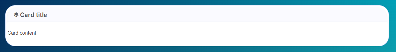
<card-component
  :is-in-modal="false"
  title="Card title"
  title-class="is-size-5"
  icon="layers"
  class="no-footer px-0"
>
  <p>Card content</p>
</card-component>
Props
| Name | Description | Type | Required | Default |
|---|---|---|---|---|
| title | The card title | String | false | null |
| subtitle | The card subtitle | String | false | null |
| cardStyle | The card style | String | false | "" |
| titleClass | The extra classes style | String | false | "is-size-4" |
| subtitleClass | The extra classes style | String | false | "is-size-5" |
| icon | The icon name | String | false | null |
| isInModal | It define if the card is displayed inside a modal or not. | Boolean | false | false |
| modalWidth | The modal width | Number | false | 400 |
Events
| Event Name | Description | Parameters |
|---|---|---|
| modalClose | - | - |
Slots
| Name | Description | Default Slot Content |
|---|---|---|
| header-extra-content | Header extra content | - |
| default | Default | - |
| footer | Footer | - |
| header-extra-content | Header extra content (modal) | - |
| default | Default (modal) | - |
| footer | Footer (modal) | - |