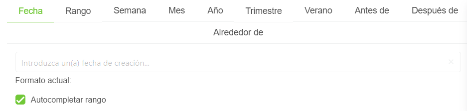
DateTimeTabsSelectorComponent
This component allows you to create a datetime component in what you can especify even more the datetime that you want to insert.
It depends on DateComponent, DateTimeComponent, DateTimePickerComponent.
Example
<date-time-tabs-selector-component
  active-operator="activeOperator"
  editable="editable"
  show-clear-button="showClearButton"
  show-today-button="showTodayButton"
  validation-mode="validationMode"
  hide-validation="hideValidation"
  locale="locale"
>
  <slot name="input-label" />
  <slot name="custom-tabs" />
</date-time-tabs-selector-component>
Props
| Name | Description | Type | Required | Default |
|---|---|---|---|---|
| value | Inner value of the component | — | false | Mon Apr 10 2023 10:02:43 GMT-0400 (Cuba Daylight Time) |
| activeOperator | Allows you to indicate the active operator in the component | String | false | "date" |
| minDate | Allows you to indicate the selectable min dateeslint-disable-next-line vue/require-default-prop | Date | false | - |
| maxDate | Allows you to indicate the selectable max dateeslint-disable-next-line vue/require-default-prop | Date | false | - |
| horizontal | Allows you to indicate if the component will be horizontal or not | Boolean | false | false |
| appendToBody | Same as append-to-body in Buefy b-datepicker | Boolean | false | true |
| editable | Allows you to indicate if the date is editable | Boolean | false | true |
| showClearButton | Allows you to indicate if the clear bottom will be displayed or not | Boolean | false | true |
| showTodayButton | Allows you to indicate if the today button will be displayed or not | Boolean | false | true |
| dateTimeFormat | Allows you to indicate the format of the returned datetime | String | false | "DD/MM/YYYY hh:mm A" |
| validationMode | Validation mode to ValidationProvider | String | false | "eager" |
| hideValidation | Allows you to indicate if show validation or not | Boolean | false | false |
| locale | Locale string {en, es ...} for display language on component | String | false | "en" |
Events
| Event Name | Description | Parameters |
|---|---|---|
| input | - | - |
| operatorUpdated | - | - |
| clearedOutValues | - | - |
Slots
| Name | Description | Default Slot Content |
|---|---|---|
| input-label | - | - |
| custom-tabs | - | - |