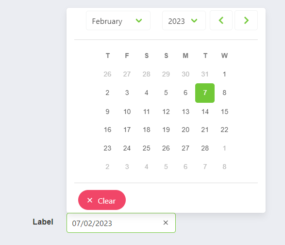
DateComponent
This component allows you to create a date component.
It depends on SelectComponent, ValidationObserver, extend and required from Vee Validate.
Example
<date-component
    label="Label",
    placeholder="Placeholder",
    :min-date-time:"new Date()",
    :show-clear-button:"true",
    :show-now-button:"true",
    :append-to-body:"true",
    position="is-top-right"
>
    <slot name="input-label" />
</date-component>
Props
| Name | Description | Type | Required | Default |
|---|---|---|---|---|
| value | Inner value of the component | — | false | null |
| horizontal | Allows you to indicate if the component will be horizontal or not | Boolean | false | true |
| format | Allows you to indicate the format of the returned date | String | false | "DD/MM/YYYY" |
| showClearButton | Allows you to indicate if the clear bottom will be displayed or not | Boolean | false | false |
| showTodayButton | Allows you to indicate if the today button will be displayed or not | Boolean | false | false |
| minDate | Allows you to indicate the selectable min date | Date | false | - |
| maxDate | Allows you to indicate the selectable max date | Date | false | - |
| editable | Allows you to indicate if the date is editable | Boolean | false | false |
| isRequired | Allows you to indicate if the date is required | Boolean | false | false |
| labelInside | Allows you to indicate if the label will be inside of the input | Boolean | false | false |
| labelOnBorder | Allows you to indicate if the label will be on the border of the input | Boolean | false | false |
| mobileNative | Same as mobile-native in Buefy b-datepicker | Boolean | false | false |
| type | Same as type in Buefy b-datepicker | String | false | undefined |
| range | Same as range in Buefy b-datepicker | Boolean | false | false |
| appendToBody | Same as append-to-body in Buefy b-datepicker | Boolean | false | false |
| position | Same as position in Buefy b-datepicker | String | false | undefined |
| mobileModal | Same as mobile-modal in Buefy b-datepicker | Boolean | false | true |
| size | Same as size in Buefy b-datepicker | String | false | undefined |
| validationMode | Validation mode to ValidationProvider | String | false | "aggressive" |
| hideValidation | Allows you to indicate if show validation or not | Boolean | false | false |
| locale | Locale string {en, es ...} for display language on component | String | false | "en" |
| showWeekNumber | Allows you to indicate if show week number or not | Boolean | false | false |
| weekNumberClickable | Allows you to indicate if week number will be clickable or not | Boolean | false | false |
| firstDayOfWeek | Allows you to indicate the first number of the week | Number | false | 4 |
| unselectableDaysOfWeek | Allows you to indicate if days of eek will be unselectable | Boolean | false | false |
Events
| Event Name | Description | Parameters |
|---|---|---|
| input | - | - |