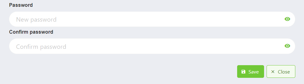
ChangePasswordForm
This component allows you to create a form to change passwords.
It depends on CardComponent, PasswordComponent and ValidationObserver from Vee Validate.
Example
<change-password-form
    class="ghost-card"
    :locale="locale"
    title="Title"
    :rounded-inputs="true"
    :expanded-inputs="true"
    :horizontal-inputs="false"
    inputs-size="is-medium"
    :vbtn="vbtn"
/>

export default {
  name: 'App',
  data() {
    return {
      vbtn: {
        close: {
          icon: 'close',
          label: "Label",
          props: {
            outlined: true,
            rounded: true,
            class: 'mr-3',
            size: 'is-medium'
          },
          show: false
        },
        save: {
          icon: 'key-chain',
          label: "Label",
          props: {
            rounded: true,
            size: 'is-medium'
          },
          show: true
        }
      }
    }
  }
}
Props
| Name | Description | Type | Required | Default |
|---|---|---|---|---|
| requiresCurrentPassword | Same as PasswordComponent | Boolean | false | false |
| horizontalInputs | Same as horizontal in PasswordComponent | Boolean | false | true |
| expandedInputs | Same as expanded in PasswordComponent | Boolean | false | false |
| roundedInputs | Same as rounded in PasswordComponent | Boolean | false | false |
| inputsSize | Same as size in PasswordComponent | String | false | undefined |
| validationMode | Same as PasswordComponent | String | false | "aggressive" |
| passwordReveal | Same as PasswordComponent | Boolean | false | true |
| minCharsPasswordInputs | Same as min-chars in PasswordComponent | Number | false | 8 |
| labelInsideInputs | Same as label-inside in PasswordComponent | Boolean | false | false |
| labelOnBorderInputs | Same as label-on-border in PasswordComponent | Boolean | false | false |
| isModerate | Same as is-moderate in PasswordComponent | Boolean | false | false |
| isComplex | Same as complex in PasswordComponent | Boolean | false | false |
| title | Sets the title of the card | String | false | "Set Password" |
| titleClass | Sets the class of the title of the card | String | false | "is-size-5" |
| subtitle | Sets the subtitle of the card | String | false | undefined |
| subtitleClass | Sets the class of the subtitle of the card | String | false | "is-size-6" |
| isInModal | Indicates if the component es on a modal | Boolean | false | false |
| isLoading | Indicates if the component is loading | Boolean | false | false |
| modalWidth | Sets the width of the component | Number | false | 550 |
| locale | Locale string {en, es ...} for display language on component | String | false | "en" |
Events
| Event Name | Description | Parameters |
|---|---|---|
| save | - | - |
| form-close | - | - |