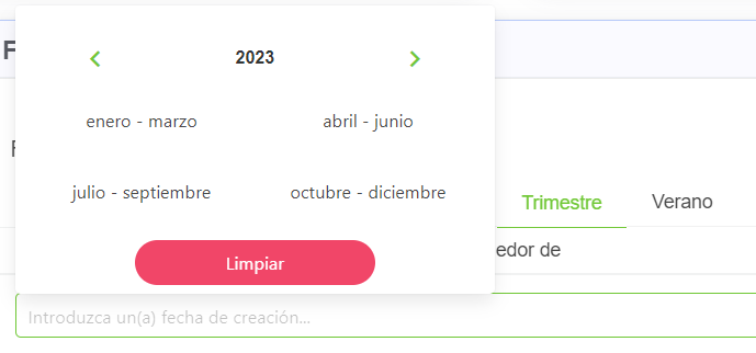
YearSummerTrimesterDatePicker
This component allows you to create a customized date picker.
It depends on ValidationObserver, extend and required from Vee Validate.
Example
<year-summer-trimester-date-component
  picker-type="'summer'"
  scrollable="false"
  expanded="true"
  dateFormat="trimesterSummerDateFormat"
  validationMode="validationMode"
  hideValidation="hideValidation"
  locale="locale"
></year-summer-trimester-date-component>
Props
| Name | Description | Type | Required | Default |
|---|---|---|---|---|
| pickerType | Suported values are year, trimester and summer | String | false | "year" |
| yearInterval | Allows you to indicate the interval between the years | Number | false | 10 |
| value | - | Array / Number / Object | false | null |
| isRequired | Allows you to indicate if the date is required | Boolean | false | false |
| validationMode | Validation mode to ValidationProvider | String | false | "aggressive" |
| hideValidation | Allows you to indicate if show validation or not | Boolean | false | false |
| mobileModal | Same as mobile-modal in Buefy b-dropdown | Boolean | false | true |
| dateFormat | Allows you to indicate the format of the date | String | false | "YYYY-MM-DD" |
| locale | Locale string {en, es ...} for display language on component | String | false | "en" |
Events
| Event Name | Description | Parameters |
|---|---|---|
| input | - | - |