TreeNodePicker
This component allows you to can used as a quick menu or even like a select for discoverable content
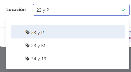
Example
export default {
  name: "App",
  data() {
    return {
      form: {
        servicesDefinition: {
          type: TreeNodePicker,
          "field-wrapper": { class: "is-12" },
          "field-input": {
            label: this.$tc("location", 1),
            expanded: true,
            horizontal: true,
            placeholder: this.$t("placeholder", {
              key: this.$tc("location", 1).toLowerCase(),
            }),
            propertyNames: { text: "name" },
            treeData: this.$store.state.locationNodes,
            maxHeight: 220,
            itemNoChildrenIcon: "tag-text",
            itemCollapsedIcon: "office-building-marker",
            itemExpandedIcon: "office-building-marker-outline",
            isRequired: false,
          },
        },
      },
    };
  },
};
Props
| Name | Description | Type | Required | Default |
|---|---|---|---|---|
| vid | - | String | false | undefined |
| value | - | — | false | null |
| treeData | - | Array / Promise | false | |
| propertyNames | Redefines internal tree structure Ex: {'text': 'customName','children': 'kids'} | Object | false | - |
| pathSeparator | - | String | false | "/" |
| labelInside | - | Boolean | false | false |
| labelOnBorder | - | Boolean | false | false |
| validationMode | - | String | false | "aggressive" |
| hideValidation | - | Boolean | false | false |
| isRequired | - | Boolean | false | false |
| mobileModal | - | Boolean | false | true |
| maxHeight | - | Number | false | 300 |
| isScrollable | - | Boolean | false | true |
| showClearIcon | - | Boolean | false | false |
| clearIconSize | - | String | false | "is-small" |
| clearIconCustomClass | - | String | false | "" |
| itemNoChildrenIcon | - | String | false | "folder-outline" |
| itemCollapsedIcon | - | String | false | "folder" |
| itemExpandedIcon | - | String | false | "folder-open" |
| iconSize | - | String | false | "is-small" |
| locale | Locale string {en, es ...} for display language on component | String | false | "en" |
Events
| Event Name | Description | Parameters |
|---|---|---|
| input | - | - |