TimeComponent
This component allows you to create a time component.
It depends on ValidationObserver, extend and required from Vee Validate.
Example
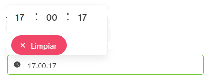
<time-component
    :is-required="false",
    :show-clear-button="true",
    :show-now-button="true",
    position="is-top-right",
    convert-unit="milliseconds",
/>
Props
| Name | Description | Type | Required | Default |
|---|---|---|---|---|
| value | - | — | false | null |
| horizontal | Allows you to indicate if the component will be horizontal or not | Boolean | false | true |
| hourFormat | Allows you to indicate the format of the returned hour | String | false | "24" |
| locale | Locale string {en, es ...} for display language on component | String | false | "es-MX" |
| convertUnit | Allows you to indicate the unit of convertion | String | false | "" |
| showClearButton | Allows you to indicate if the clear bottom will be displayed or not | Boolean | false | false |
| minTime | Allows you to indicate the selectable min time | Date | false | - |
| maxTime | Allows you to indicate the selectable max time | Date | false | - |
| editable | Allows you to indicate if the time is editable | Boolean | false | true |
| isRequired | Allows you to indicate if the date is required | Boolean | false | true |
| labelInside | Allows you to indicate if the label will be inside of the input | Boolean | false | false |
| labelOnBorder | Allows you to indicate if the label will be on the border of the input | Boolean | false | false |
| mobileNative | Same as mobile-native in Buefy b-timepicker | Boolean | false | false |
| enableSeconds | Allows you to indicate if the seconds will be enebled or not | Boolean | false | true |
| inline | Same as inline in Buefy b-timepicker | Boolean | false | false |
| loading | Same as loading in Buefy b-timepicker | Boolean | false | false |
| position | Same as position in Buefy b-timepicker | String | false | "is-bottom-right" |
| appendToBody | Same as append-to-body in Buefy b-timepicker | Boolean | false | false |
| size | Same as size in Buefy b-timepicker | String | false | undefined |
| validationMode | Validation mode to ValidationProvider | String | false | "eager" |
| hideValidation | Allows you to indicate if show validation or not | Boolean | false | false |
Events
| Event Name | Description | Parameters |
|---|---|---|
| input | - | - |
Component:props:end -->
Events
| Event Name | Description | Parameters |
|---|---|---|
| input | - | - |