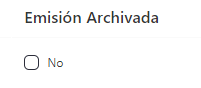
CheckBoxColumnComponent
Uses the b-checkbox component, see Buefy documentation
Example
<template>
  <div>
    <section>
      <server-table-component
        data-url="/services"
        v-bind="servicesDefinition"
      />
    </section>
  </div>
</template>;

export default {
  name: "App",
  data() {
    return {
      servicesDefinition: {
        vtable: {
          headers: [
            {
              text: "Service Id",
              value: "service_Id",
              align: "left",
              render: {
                type: CheckBoxColumnComponent,
                props: {
                  content: "archived",
                  disabled: this.readOnly,
                },
                events: {
                  "selection-update": (v) => this.setArchived(v),
                },
              },
              sortable: true,
              class: "white-space-nowrap",
            },
          ],
        },
      },
    };
  },
};
Props
| Name | Description | Type | Required | Default |
|---|---|---|---|---|
| value | - | — | false | - |
| isRequired | - | Boolean | false | false |
| indeterminate | Same as native indeterminate | Boolean | false | false |
| size | - | String | false | "is-small" |
| disabled | - | Boolean | false | false |
| content | - | String | false | "" |
Events
| Event Name | Description | Parameters |
|---|---|---|
| selection-update | - | - |