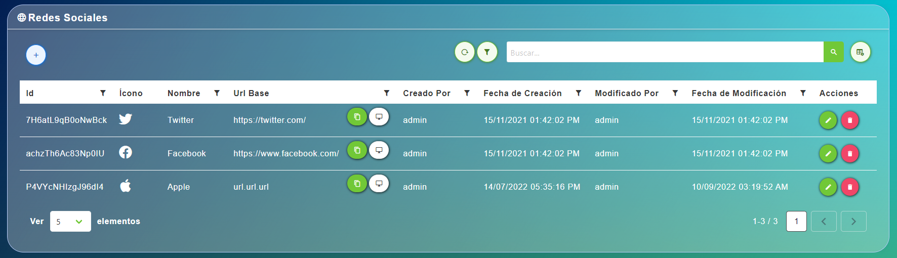
ServerTableComponent
This component allows you to create a custome server table.
With server means it connects to a server API end-point.
It depends on ValidationObserver from Vee Validate and it can receive any type of column-component created in the definition binded.
Example
<template>
  <div>
    <section>
      <server-table-component
        data-url="/services"
        v-bind="servicesDefinition"
      />
    </section>
  </div>
</template>;

export default {
  name: "App",
  data() {
    return {
      servicesDefinition: {
        vtable: {
          headers: [
            {
              text: "Service Id",
              value: "service_Id",
              align: "left",
              render: {
                type: NumberFormatColumnComponent,
              },
              sortable: true,
              class: "white-space-nowrap",
            },
            {
              text: "Service Name",
              value: "service_Name",
              align: "left",
              sortable: true,
              custom: true,
              render: {
                type: ContentButtonColumnComponent,
                props: {
                  content: "service_Name",
                  button: {
                    isRounded: true,
                    type: "",
                    icon: "monitor",
                    size: "is-small",
                    tooltip: {
                      label: "Visualize original values",
                      position: "is-top",
                      type: "is-white",
                    },
                  },
                },
                events: {
                  "button-clicked": this.showOriginalValues,
                },
              },
            },
            {
              text: "Service Provider",
              value: "service_Provider_Name",
              align: "left",
              sortable: true,
              custom: true,
              render: {
                type: ContentButtonColumnComponent,
                props: {
                  content: "service_Provider_Name",
                  button: {
                    isRounded: true,
                    type: "",
                    icon: "monitor",
                    size: "is-small",
                    tooltip: {
                      label: "Visualize original values",
                      position: "is-top",
                      type: "is-white",
                    },
                  },
                },
                events: {
                  "button-clicked": this.showOriginalValuesProvider,
                },
              },
            },
            {
              text: "Service Type",
              value: "service_Type_Name",
              align: "left",
              sortable: true,
              rendervalue: (v) => this.$snakeToTitle(v),
            },
            {
              text: "Event Actions",
              value: "",
              align: "left",
              render: {
                type: MultipleButtonsColumnComponent,
                props: {
                  buttons: [
                    {
                      icon: "monitor",
                      type: "is-primary",
                      tooltip: {
                        label: "Visualize events",
                        type: "is-primary",
                        position: "is-top",
                      },
                    },
                  ],
                },
                events: {
                  button0Clicked: this.visualizeServiceEvents,
                },
              },
              sortable: false,
            },
          ],
        },
        vbtn: {
          create: {
            show: false,
          },
        },
        title: "Services",
        sortTypeField: "sortType",
        findSearchField: "searchText",
        sortWithSign: true,
        sortFieldName: "sorts",
        paginationLengthField: "pageSize",
        headerIcon: "animation",
      },
    };
  },
};
Is mandatory that each column's header has it correspond value property.
Is important to note that the value property is necesary not only to display a column text value, also it's received as a parameter on table sort event. If the value is not defined the sort method is not applied correctly.
The column's components available
- BoolToTextColumnComponent
- ButtonColumnComponent
- ContentButtonColumnComponent
- DateColumnComponent
- FileSizeColumnComponent
- IconColumnComponent
- ImageColumnComponent
- LargeTextColumnComponent
- MultipleButtonsColumnComponent
- NumberFormatColumnComponent
- TimeSpanColumnComponent
Props
| Name | Description | Type | Required | Default |
|---|---|---|---|---|
| title | - | String | false | "Table Component" |
| subtitle | - | String | false | undefined |
| dataUrl | The URL to conect to the API end-point | String | false | null |
| modalWidth | The modal width | Number | false | 400 |
| stickyHeaders | Show a sticky table header | Boolean | false | true |
| rowClass | - | Function | false | undefined |
| isRowChekable | - | Function | false | () => true |
| selectedSyncActive | - | Boolean | false | false |
| notify | - | Boolean | false | true |
| selected | - | Object | false | null |
| selectable | - | Boolean | false | false |
| customHeaders | - | Boolean | false | false |
| isDetailed | - | Boolean | false | false |
| showDetailIcon | - | Boolean | false | true |
| eventConstants | To check events errors with eventsErrorCheckMixin | Object | false | [object Object] |
| checkedRowsIds | List of external Ids of checked rows to check | Array | false | |
| getCheckedRows | Return [] of row objects that fit a criteria to sync to internal checked rows. Recives (ids, records) | Function | false | undefined |
| locale | Locale string {en, es ...} for display language on component | String | false | "es" |
| name | Name of the component that uses it | String | false | "" |
| dbclick | - | Boolean | false | false |
Events
| Event Name | Description | Parameters |
|---|---|---|
| checkedRows | - | - |
| selectedRow | - | - |
| update:selected | - | - |
| clearSearch | - | - |
| dbclick:selected | - | - |
| columnDragStart | - | - |
| columndrop | - | - |
| available-records | - | - |
| form-close | Fire an event to the parent when the form is closed | - |
| before-form-open | Fire an event to the parent before the form will open. Retrieves form and id if editing | - |
| form-open | Fire an event to the parent before when the form is open | - |
| dragStart | - | - |
| onDrop | - | - |
| contextmenu | - | - |
| open-column-filter | - | - |
| cleanFilters | - | - |
Slots
| Name | Description | Default Slot Content |
|---|---|---|
| header-extra-content | Header extra content | - |
| extra-header-buttons | Header extra buttons | - |
| right-extra-header-content | Header extra buttons | - |
| extra-content | Extra content | - |