CardFormSubmitComponent
This component allows you to create a card component with a form to submit.
It depends on ValidationObserver from Vee Validate and it can receive any type of column-component created in the definition binded.
It depends on CardComponent component to.
Example
<card-form-submit-component
v-for="(card, key) in form"
:key="key"
:card-title="card.title"
:submit-url="card.submitUrl"
:form="card.form"
/>
import TextComponent from 'premium-tesh-ui-lib'
export default {
name: 'App',
data() {
return {
form: {
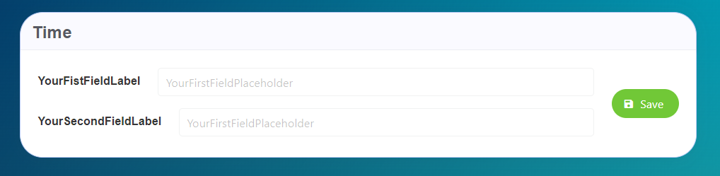
FirstCard: {
title: 'Time',
submitUrl: '/url',
form: {
FirstField: {
type: TextComponent,
value: '',
default: ''
'field-wrapper': { class: 'is-12' },
'field-input': {
label: 'YourFistFieldLabel',
placeholder: 'YourFirstFieldPlaceholder'
}
},
SecondField: {
type: TextComponent,
value: '',
default: '',
'field-wrapper': { class: 'is-12' },
'field-input': {
label: 'YourSecondFieldLabel',
placeholder: 'YourFirstFieldPlaceholder'
}
}
}
}
}
}
}
}
Props
| Name | Description | Type | Required | Default |
|---|---|---|---|---|
| form | The form to show on the component | Object | false | - |
| cardTitle | The card title | String | false | "" |
| titleClass | The title class | String | false | "is-size-4" |
| cardSubtitle | The card subtitle | String | false | null |
| cardSubtitleClass | The subtitle class | String | false | "is-size-5" |
| submitUrl | The submit url | String | false | "" |
| submitDisabled | Disable the submit option. you will not able to submit | Boolean | false | false |
| locale | Locale string {en, es ...} for display language on component | String | false | "en" |