PasswordComponent
This component allows you to create a password component
Example
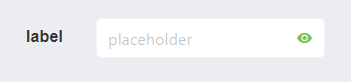
<password-component
  :label="label"
  :placeholder="placeholder"
  :horizontal="horizontal"
  :validation-mode="validationMode"
  :password-reveal="passwordReveal"
  :label-inside="labelInside"
  :label-on-border="labelOnBorder"
  :locale="locale"
  :rounded="rounded"
  :expanded="expanded"
  :size="size"
  @input="input"
></password-component>
Props
| Name | Description | Type | Required | Default |
|---|---|---|---|---|
| horizontal | - | Boolean | false | true |
| vid | - | String | false | undefined |
| value | - | — | false | null |
| labelInside | - | Boolean | false | false |
| labelOnBorder | - | Boolean | false | false |
| validationMode | - | String | false | "aggressive" |
| hideValidation | - | Boolean | false | false |
| passwordReveal | Add the reveal password functionality | Boolean | false | true |
| minChars | - | Number | false | 8 |
| matchWith | - | String | false | "" |
| isModerate | - | Boolean | false | false |
| isComplex | - | Boolean | false | false |
| iconRight | - | String | false | undefined |
| iconRightClickable | - | Boolean | false | false |
| iconRightClick | - | Function | false | () => {} |
| clearIconSize | - | String | false | "is-small" |
| clearIconCustomClass | - | String | false | "" |
| showClearIcon | - | Boolean | false | false |
| locale | Locale string {en, es ...} for display language on component | String | false | "en" |
Events
| Event Name | Description | Parameters |
|---|---|---|
| input | - | - |