DateTimeComponent
This component allows you to create a datetime component.
It depends on ValidationObserver, extend and required from Vee Validate.
Example
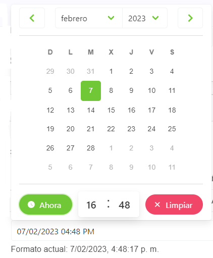
<date-time-component
    label="Label",
    placeholder="Placeholder",
    :min-date-time="new Date()",
    :show-clear-button="true",
    :show-now-button="true",
    :append-to-body="true",
    position="is-top-right"
/>
Props
| Name | Description | Type | Required | Default |
|---|---|---|---|---|
| value | Inner value of the component | — | false | null |
| horizontal | Allows you to indicate if the component will be horizontal or not | Boolean | false | true |
| focusable | Same as focusable in Buefy b-datetimepicker | Boolean | false | true |
| format | Allows you to indicate the format of the returned date | String | false | "DD/MM/YYYY HH:mm" |
| showClearButton | Allows you to indicate if the today button will be displayed or not | Boolean | false | false |
| showNowButton | Allows you to indicate if the now button will be displayed or not | Boolean | false | false |
| minDateTime | Allows you to indicate the selectable min datetime | Date | false | - |
| maxDateTime | Allows you to indicate the selectable max datetime | Date | false | - |
| editable | Allows you to indicate if the date is editable | Boolean | false | true |
| isRequired | Allows you to indicate if the date is required | Boolean | false | false |
| labelInside | Allows you to indicate if the label will be inside of the input | Boolean | false | false |
| labelOnBorder | Allows you to indicate if the label will be on the border of the input | Boolean | false | false |
| mobileNative | Same as mobile-native in Buefy b-datetimepicker | Boolean | false | false |
| type | Same as type in Buefy b-datetimepicker | String | false | undefined |
| range | Same as range in Buefy b-datetimepicker | Boolean | false | false |
| appendToBody | Same as append-to-body in Buefy b-datetimepicker | Boolean | false | false |
| position | Same as position in Buefy b-datetimepicker | String | false | undefined |
| mobileModal | Same as mobile-modal in Buefy b-datetimepicker | Boolean | false | true |
| size | Same as size in Buefy b-datetimepicker | String | false | undefined |
| inline | Same as inline in Buefy b-datetimepicker | Boolean | false | false |
| loading | Same as loading in Buefy b-datetimepicker | Boolean | false | false |
| datepicker | Same as datepicker in Buefy b-datetimepicker | Object | false | undefined |
| timepicker | Same as timepicker in Buefy b-datetimepicker | Object | false | undefined |
| validationMode | Validation mode to ValidationProvider | String | false | "aggressive" |
| hideValidation | Allows you to indicate if show validation or not | Boolean | false | false |
| activeTab | Allows you to indicate what is the active tab | String | false | "" |
| locale | Locale string {en, es ...} for display language on component | String | false | "en" |
Events
| Event Name | Description | Parameters |
|---|---|---|
| input | - | - |