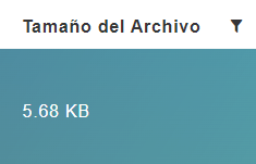
FileSizeColumnComponent
This component allows you to file size column
Example
<template>
  <div>
    <section>
      <server-table-component
        data-url="/services"
        v-bind="servicesDefinition"
      />
    </section>
  </div>
</template>;

export default {
  name: "App",
  data() {
    return {
      servicesDefinition: {
        vtable: {
          headers: [
            {
              text: "Service Id",
              value: "service_Id",
              align: "left",
              render: {
                type: FileSizeColumnComponent,
                props: {
                  content: this.$t("fileSize"),
                  locale: this.$i18n.locale,
                  textLenght: 15,
                  tooltipPosition: "is-top",
                },
              },
              sortable: true,
              class: "white-space-nowrap",
            },
          ],
        },
      },
    };
  },
};
Props
| Name | Description | Type | Required | Default |
|---|---|---|---|---|
| value | - | Number / String | false | - |
| fallbackValue | Value fallback | String | false | "----" |
| textLenght | - | Number | false | 50 |
| roundedButtons | - | Boolean | false | true |
| modalTitleClass | - | String | false | "is-size-5 has-text-primary has-text-centered" |
| modalWidth | - | Number | false | 400 |
| content | - | String | false | "" |
| appendToBody | Append content to body (prevents event bubbling) | Boolean | false | false |
| tooltipPosition | - | String | false | "is-top" |
| tooltipType | - | String | false | "is-white" |
| locale | Locale string {en, es ...} for display language on component | String | false | "en" |